


In my previous article Things you need to know before switching to Jetpack Compose, I discussed the basic principles of building UI using Jetpack Compose.
Today, let's dive a little deeper into how layouts work in Compose and learn how to build a more complex UI.
Contents
1. The basics of layouting in Compose / Three basic layout
2. Dissecting the layouts
3. The Modifier. Size / Appearance / Interactivity
4. Summary
The basics of layouting in Compose
Before we begin
Nesting layouts in .XMLs, is considered very bad practice since the performance hit due to remeasuring and recalculating the position of children is quite noticeable, especially when nesting more heavyweight layouts.
One of the main differences in Compose that fundamentally changes how we structure UI is that Compose doesn't allow measuring of layout children more than once. In fact, it will even throw a RuntimeException if that ever happens.
Therefore, you can nest composables as much as you like without worrying about performance.
With that out of the way, let's dive in!
The first thing to remember about composable functions is that they don't return anything, or rather they return Unit since we live in the Kotlin world. This might confuse some folk coming from React Native or Flutter, where similar functions do return components or widgets to build UI.
In Compose, we describe our UI, and every composable we put inside a composable function will be reflected on the screen in one way or another.
For example:
@Composable
fun Haiku() {
    Text(text = "I write, erase, rewrite")
    Text(text = "Erase again, and then")
    Text(text = "A poppy blooms.")
}
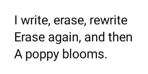
This is a perfectly fine composable, which draws every one of the Text composables on the screen.
However, we didn't specify how exactly we want to display our lines of text, and therefore we get a quite predictable result:

Three basic layouts
If you have read my previous article, you might remember that we have used a Row to display the elements one after the other, or in other words in a row.
It would only make sense then to have another layout composable called Column. And, in fact, we do.
These are the main building blocks of UI in Compose. In most cases, we will use a combination of Rows and Columns to get the desired result.
There is another basic layout that we can use, called Box.
Here is an illustration of these basic layouts, courtesy of the official Compose documentation:
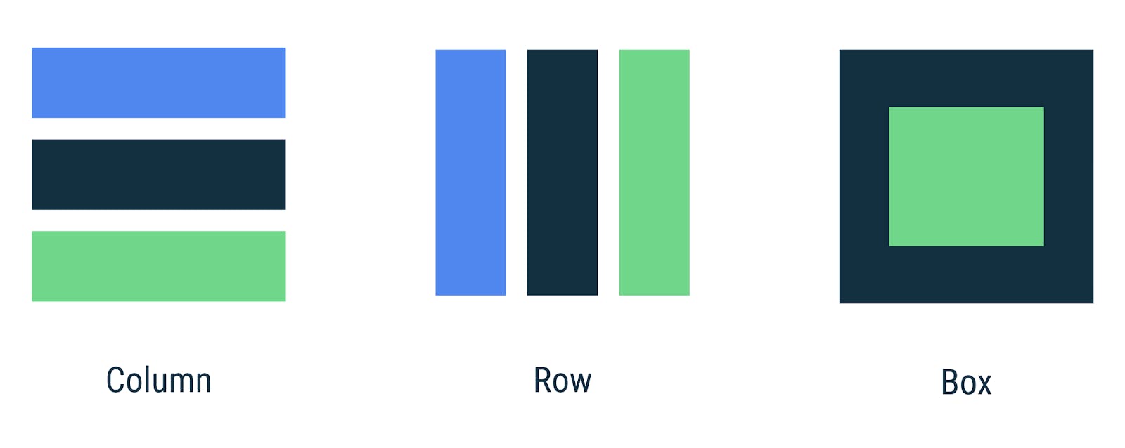
Speaking about how these layouts stack children, we could say that:
Columnis similar to verticalLinearLayout;Rowis similar to horizontalLinearLayout;Boxis similar toFrameLayout.
But please keep in mind that these composable layouts are much more than their imperative counterparts. In fact, in most cases, these three layouts are all you need to build any UI. Using only LinearLayouts to build our UI would be a huge no-no. However, since nesting in Compose doesn't affect performance - this is the standard way here.
Note: There is a
ConstraintLayoutin Compose that allows a more sophisticated layouting. I will probably write a separate article about it but keep in mind that even thoughConstraintLayoutwas a recommended way to build layouts until now to avoid nesting layouts, in Jetpack Compose, you don't actually need it.
Now, let's return to our haiku and try to fix it.
In order to display the Text lines in a column, all we have to do is to wrap them inside a Column composable:
@Composable
fun Haiku() {
    Column {
        Text(text = "I write, erase, rewrite")
        Text(text = "Erase again, and then")
        Text(text = "A poppy blooms.")
    }
}
Which gives us the desired outcome:
One thing to keep in mind here is that if you don't specify the layout of the children, they will be affected by the parent of the composable.
For example, the following code will give us the same result:
class MainActivity : ComponentActivity() {
    override fun onCreate(savedInstanceState: Bundle?) {
        super.onCreate(savedInstanceState)
        setContent {
            // This Column will affect the contents of our composable
            Column {
                Haiku()
            }
        }
    }
}

@Composable
fun Haiku() {
    Text(text = "I write, erase, rewrite")
    Text(text = "Erase again, and then")
    Text(text = "A poppy blooms.")
}
But in this case, the composable has no say in how its children will be laid out. If someone calls our Haiku from the context of a Row layout, our composable will produce an undesired result. Therefore, this approach is not recommended, just something to keep in mind for educational purposes.
Dissecting the layouts
As I have said before, these basic layouts are much more than meets the eye. In fact, they provide us with everything we might need to build UI.
Let's see what we can do with them.
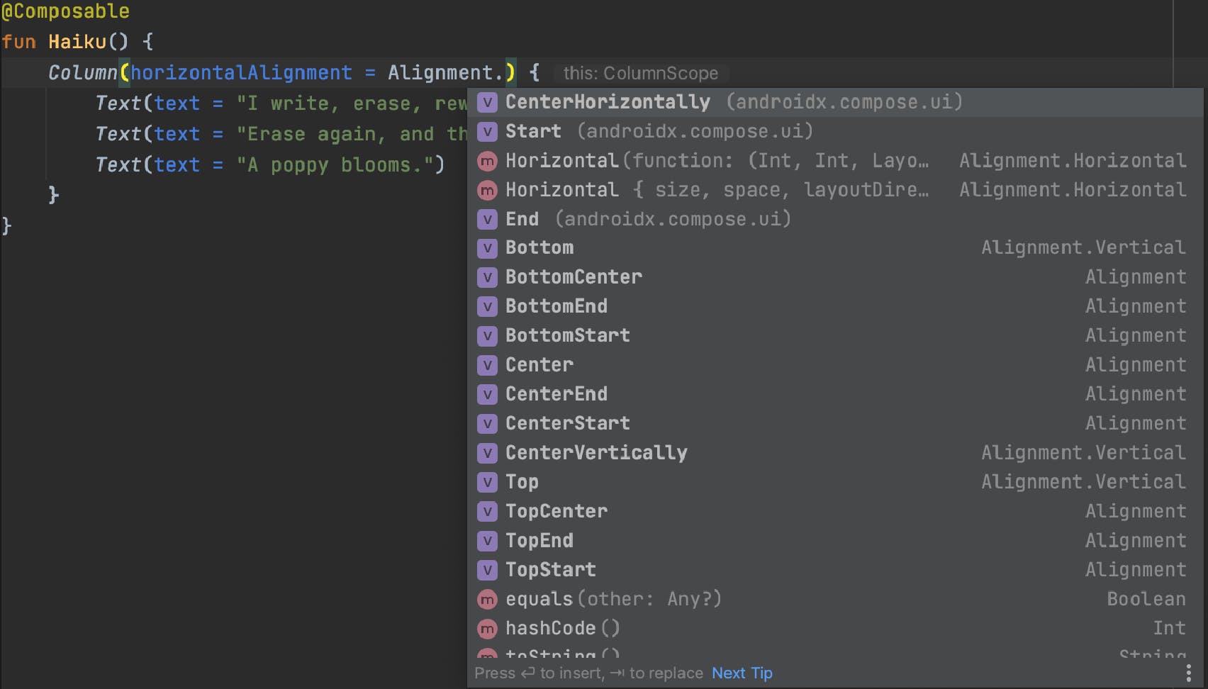
For that, here is a quick tip for those who don't use shortcuts much.
You can press CMD/Ctrl + P inside a constructor's or function's argument brackets, and Android Studio will show every possible argument with default values.
Note: you can also do it inside the trailing lambda since technically, it is an argument you pass.
I cropped this image a bit to be legible on smaller screens, but you get the point.
This way, you can always see what options are available to you. And if you need some additional information, nothing beats opening a source code and reading the declaration.
With that out of the way, let's see what we can do with our Column.
The Column
@Composable
inline fun Column(
    modifier: Modifier = Modifier,
    verticalArrangement: Arrangement.Vertical = Arrangement.Top,
    horizontalAlignment: Alignment.Horizontal = Alignment.Start,
    content: @Composable ColumnScope.() -> Unit
)
At first glance, there isn't much. However, the first parameter that takes in a Modifier is a true powerhouse in the Compose world, and you will be using it a lot.
Let's leave it for now and take a look at the other parameters.
The content
The content is a function with a ColumnScope as a receiver. If you are not familiar with this Kotlin concept, you can read about it here. What it does is it makes the ColumnScope as this inside the function.
This is the content we want to display inside our Column.
The horizontalAlignment
horizontalAlignment defines how we align our content horizontally, and all the expected options are supported:
However, please note that arguments of type Alignment.Vertical will not be accepted here. Those are used in the Row layout.
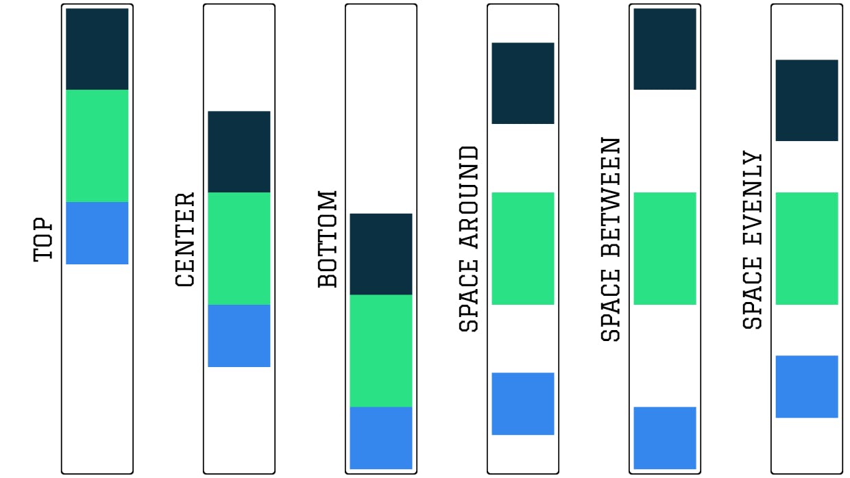
The verticalArrangement
The idea of arrangement might be new to some people coming to declarative UI. Still, even in the imperative approach, we had a similar concept when defining how to position chained items inside a ConstraintLayout.
verticalArrangement defines how children will be arranged along the height of the column.
Here are the available options for Arrangement.Vertical:
And before we tackle the modifier, let's take a look at the arrangement/alignment options for the other basic layouts.
The Row
The Row is pretty much the same as the Column:
@Composable
inline fun Row(
    modifier: Modifier = Modifier,
    horizontalArrangement: Arrangement.Horizontal = Arrangement.Start,
    verticalAlignment: Alignment.Vertical = Alignment.Top,
    content: @Composable RowScope.() -> Unit
)
The main difference is that the Arrangement and Alignment are switched.
The verticalAlignment therefore takes an Alignment.Vertical as an argument, which has all the usual alignments.
And horizontalArrangement takes the Arrangement.Horizontal object, where Arrangement.Top becomes Arrangement.Start and Arrangement.Bottom becomes Arrangement.End.
The Box
Lastly, we have the Box.
@Composable
inline fun Box(
    modifier: Modifier = Modifier,
    contentAlignment: Alignment = Alignment.TopStart,
    propagateMinConstraints: Boolean = false,
    content: @Composable BoxScope.() -> Unit
)
As we have mentioned, the Box behaves similar to FrameLayout when arranging children, therefore there is no Arrangement parameter. We can only specify the Alignment, which has all the alignments we would expect to find there.
The propagateMinConstraints is nothing to concern ourselves about given the scope of this article, but for some quick info, we can refer to the KDoc:
If propagateMinConstraints is set to true, the min size set on the Box will also be applied to the content, whereas otherwise, the min size will only apply to the Box.
The Modifier
With that, we come to the modifier. Although we are talking about layouts today, you can apply the Modifier to any composable, which allows us to, yes, you've guessed it, modify the composable. And layouts are composables, after all.
There are a lot of things we can do with the Modifier, but for the sake of keeping this article at a manageable size, we will only look at the most common use cases.
That said, first things first. Before looking into specific modifiers, let's once again start by understanding what the Modifier object really is.
Under the hood
Here is what we can find in the declaration.
/**
* An ordered, immutable collection of modifier elements
* that decorate or add behavior to Compose UI elements.
* For example, backgrounds, padding, and click event listeners
* decorate or add behavior to rows, text, or buttons.
*/
interface Modifier
We can see that the Modifier represents a collection of modifier elements that change the appearance or behavior of composables.
The Modifier.Element is also a simple interface. Every modification that we can apply to composables implements this interface, which allows it to be stacked into a Modifier chain.
/**
* A single element contained within a Modifier chain.
*/
interface Element : Modifier
There are a lot of Modifier.Elements that Compose gives us out of the box, and as you can see, this approach is very flexible and allows us to write custom modifiers if needed.
By clicking the green I↓ button next to the declaration, we can see all the available Modifiers.
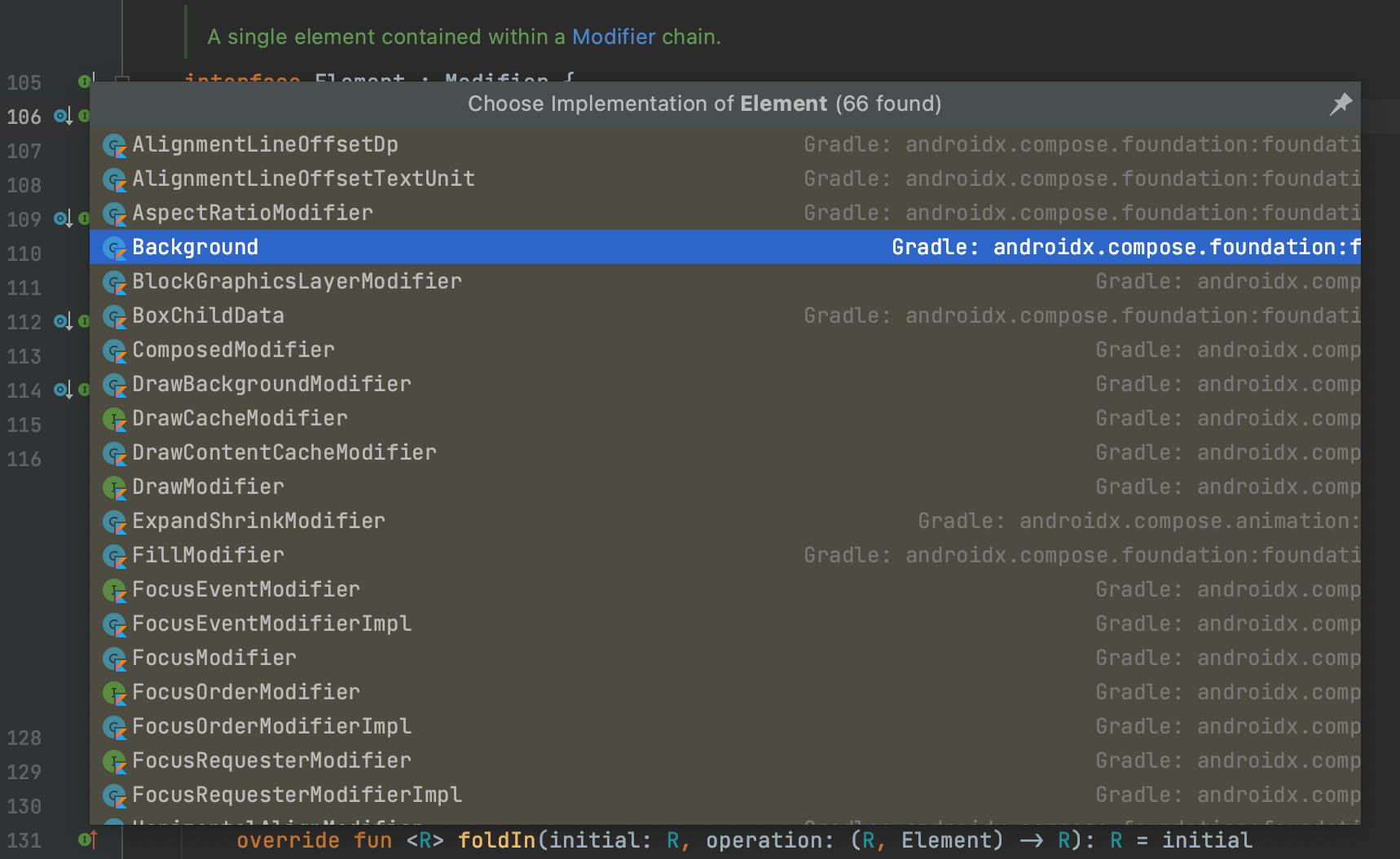
There are Background, SizeModifier, PaddingModifier, and many others that we will regularly use in Compose.
Don't worry, you don't need to memorize these implementations. Or, to be frank, even know that they exist.
I just wanted to dig a little bit deeper and show how it all works for educational purposes. Compose provides us with simple and intuitive DSL for using modifiers and you won't need to know the specifics of the implementation if you don't want to. However, I believe that knowing how the stuff we regularly use works makes us much better developers.
How chaining modifiers works
As you might have already seen in my previous article, we can use the modifiers as follows:
@Composable
fun Haiku() {
    Column(
        modifier = Modifier
            .fillMaxWidth()
            .padding(10.dp)
            .background(
                color = Color.Blue
            )
    ) {
        Text(text = "I write, erase, rewrite")
        Text(text = "Erase again, and then")
        Text(text = "A poppy blooms.")
    }
}
This is how a chain of modifiers looks in code.
Note: Please keep in mind that the modifiers will be applied in the specified order, which has an effect on how the final result will look. For example, in the code above, the padding will be applied before the background. Therefore, the blue background will be inside the padding, and the padding itself won't have any color. If we had specified the padding after the background, then the whole composable's background would be blue, including the padding.
And before I bore you to death with going through the source code, let's take a look at it one last time and see how it all comes together.
Let's take .padding() as an example:
fun Modifier.padding(all: Dp) =
    this.then(
        PaddingModifier(
            start = all,
            top = all,
            end = all,
            bottom = all,
            rtlAware = true,
            inspectorInfo = debugInspectorInfo {
                name = "padding"
                value = all
            }
        )
    )
It is a simple Kotlin extension function that creates a new PaddingModifier, which implements Modifier.Element, and passes it to the existing Modifier through the then function.
/**
* Concatenates this modifier with another.
* Returns a Modifier representing this modifier
* followed by other in sequence.
*/
infix fun then(other: Modifier): Modifier =
        if (other === Modifier) this else CombinedModifier(this, other)
As you can see, the then function adds a new Modifier to the existing chain and returns the resulting Modifier so that the chain can continue.
Not that we know how Modifier works, let's finally look at some of the most used modifiers.
Modifying the size
Most commonly, the Modifier is used for specifying the size of a composable.
// Set the width and/or height of a composable
// to specific size in Dp
.width(width: Dp)
.height(height: Dp)
// Fill all available space for width and/or height
// Equivalent of "match_parent"
//
// Can be specified with a fraction argument
// to fill a fraction of available space
.fillMaxWidth(fraction: Float = 1f)
.fillMaxHeight(fraction: Float = 1f)
// Fill all available space for both width and height
//
// Can be specified with a fraction argument
// to fill a fraction of available space
.fillMaxSize(fraction: Float = 1f)
Modifying the appearance
And here are some common Modifiers that are used for changing the appearance of a composable.
// Adds padding to the composable
.padding(all: Dp)
.padding(
    horizontal: Dp = 0.dp,
    vertical: Dp = 0.dp
)
.padding(
    start: Dp = 0.dp,
    top: Dp = 0.dp,
    end: Dp = 0.dp,
    bottom: Dp = 0.dp
)
// Modifies the alpha/scale/rotation
.alpha(alpha: Float)
.scale(scale: Float)
.scale(scaleX: Float, scaleY: Float)
.rotate(degrees: Float)
// Specifies the color and shape of the background
.background(
    color: Color,
    shape: Shape = RectangleShape
)
// Adds a border
.border(
    width: Dp,
    color: Color,
    shape: Shape = RectangleShape
)
// Clips the content to shape or bounds
.clip(shape: Shape)
.clipToBounds()
Modifying the interactivity
Modifiers are also used to describe the behavior of a composable, or, in other words, how we can interact with it.
// Adds click functionality to the composable
// Use .combinedClickable for long clicks and double clicks
.clickable(
    enabled: Boolean = true,
    onClick: () -> Unit
)
// Adds scrolling functionality to the composable
// Yes, anything can become a ScrollView!
.verticalScroll(
    state: ScrollState,
    enabled: Boolean = true,
)
.horizontalScroll(
    state: ScrollState,
    enabled: Boolean = true,
)
// Adds focus listener to the composable
.onFocusChanged(onFocusChanged: (FocusState) -> Unit)
// Adds key event listener to the composable
.onKeyEvent(onKeyEvent: (KeyEvent) -> Boolean)
// Adds size listener to the composable
.onSizeChanged(onSizeChanged: (IntSize) -> Unit)
/// ... and other listeners
Of course, this is just scratching the surface of what we can do in Compose through modifiers, but this gives a pretty good idea about how things work in this new toolkit.
Summary
We have gone through a lot of information today, haven't we?
Thanks a lot for sticking until the end.
Just to recap:
In Compose, almost everything can be drawn with Rows, Columns, and an occasional Box. There is no need for complex layouts like ConstraintLayout since nesting elements don't affect the performance as it was in the old days.
Compose is very flexible and gives us many ways how to align and arrange elements. As well as style and add behavior to our composables through the Modifier object that allows us to achieve almost any result right out of the box. And if not, you can always write your own modifiers and custom layouts.
And of course, there is no better way to learn things than doing them yourself. So fire up Android Studio, play around with Compose, and see how it works.
But keep in mind that it can become quite fun and addictive when you get a grip on it.
Until next time,
Your friend,
Max